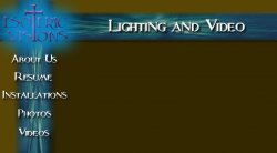
New Website Background

To many ads? Support ODJT and see no ads!
Are you a Lighting company? Then why so dark? Your image will convey the message that seems to be opposite of your function.

Just thinkin' aloud here......

Dave
 
It reminds me of Buffy the Vampire Slayer. Which I like by the way. Not sure of your target market but I'm into that stuff so it's cool.
 
Are you a Lighting company? Then why so dark? Your image will convey the message that seems to be opposite of your function.

Just thinkin' aloud here......

Dave

Honestly? Because I hate those light colored cartoony websites.

Mike

PS I think you are thinking a little deeper than most consumers. But thanks!
 
honestly casting a dark shadow on lighting is worse than attempting to use mic cable for DMx purposes. The dark colors and medieval leanings of this page is spooky at best. Consumers are much smarter and read the same blogs we do about colors and meaning etc.
 
As stated by many this look is anything but modern but if you like it and provide good service your on track with whatever branding you use as long as you keep it consistent. How will this work with promotional material, business cards, letterhead or contracts?
 
I dont do promotional material, I am just going to use the text for business cards, I am using the text and horizontal flag for letterhead, and the alternate logo for invoices.

Can you suggest a more "modern" but not cheesy, looking site?

Mike
 
you have already said you dont want bubbly bright stuff. I dont think I could get anything close to what your about Mike. I see such a divide between this and what your principles are all about. Perhaps your logo but with a light colored background. And then your kind of stuck having to use old English font with the logo to compliment one another.
 
you have already said you dont want bubbly bright stuff. I dont think I could get anything close to what your about Mike. I see such a divide between this and what your principles are all about. Perhaps your logo but with a light colored background. And then your kind of stuck having to use old English font with the logo to compliment one another.

Thanks. I guess I don't see the connection. After all light is about controlling the darkness. Darkness has its place in lighting (sometimes even more than light does). Just as air conditioning is about controlling heat, lighting is about controlling darkness.

I guess I don't see the disconnect. Light colored websites are just so.... Cheesy. Now maybe if I did kids birthday parties or something like that, maybe. But for me and what I do, I just don't see how light colors would work. Plus they would not be representative of me.

Thanks though.

Mike
 
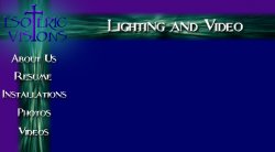
The lighter blues/purples tend to blend in with the graphics too much and they lose their pop, but I will post another one with a lighter blue/purple. In addition it is harder to mix that lighter color into the background. Also, see what I mean about it being cartoony?

Mike
 

Attachments

  • EVWebsiteNewV.jpg
    EVWebsiteNewV.jpg
    27.7 KB · Views: 2
The lighter blues/purples tend to blend in with the graphics too much and they lose their pop, but I will post another one with a lighter blue/purple. In addition it is harder to mix that lighter color into the background. Also, see what I mean about it being cartoony?

Mike

I like the blue..... drop the side graphics behind the text change the color of the logo to a contrasting to the blue..... and see what you got.....
 
just try a few more and it should be good