


New Logo. Thoughts?
- Thread starter Ron Auger
- Start date
You are using an out of date browser. It may not display this or other websites correctly.
You should upgrade or use an alternative browser.
You should upgrade or use an alternative browser.


Can you use this logo minus the speaker instead... I think it might pop more. Or atleast with the white outline... to me it would stand out better and look less like it is sunk into the background of your postcard.... just a thought.


The log is more exciting than Ron himself. Or maybe Ron is the "Big Bubble"?
(Sorry Ron, I couldn't resist).
(Sorry Ron, I couldn't resist).

Looks great! I would lose the scary dude with the mohawk though... Replace him with someone more 'friendly' looking. A phone number would be good too.
If its for a kiddies party, then the postcard serves just the purpose. But i too feel the speaker cone just doesnt match up with the the looney tune kinda font!!! Just my opinion 


Here's yet another version with some of the changes you all suggested. Also attached are some ideas for color schemes.
Attachments
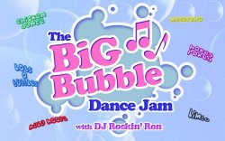


Here's yet another version with some of the changes you all suggested. Also attached are some ideas for color schemes.
Now that pops more with the white outline.... looks good to me.

I love it Ron! We should run the relay in the next Olympics. You took the baton and ran your ass off.