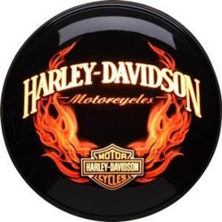
Nice play on the Harley font.
That wasn't my intention and I don't see what you mean.

Nice play on the Harley font.
Not bad, but try putting "DJ" in big letters on the left side of the mic, "Hank" on the right side of the mic, and "Davidson" below the whole thing.
(Alternately, put "DJ" and the mic on top and "Hank Davidson" below it).
That wasn't my intention and I don't see what you mean.
Using a tall narrow font with either word Harley or Davidson would invoke the logo, even though yours is a serif compared to the original. And actually it does match up to other versions of the name...
View attachment 10404

The goal is to get people to stop writing checks to "DJ" Hank Davidson. I have enough trouble getting my bank to accept
"Hank" for Henry (which Hank is a nickname for).

I love the look of the logo (color and design)
personally, I would drop the PROFESSIONAL DJ
I am not saying you are NOT a professional
but someone outside of the biz might take it the wrong way.
like someone saying they are a PROFESSIONAL actor...
if they haven't heard of you...you're not a pro to THEM!


Lord knows very few outsiders consider this job to be "professional"