
Business Cards

To many ads? Support ODJT and see no ads!
Ron, you have to decide if you want to specialize in weddings or be a generic DJ. If you sense that brides in your area want fun more than elegance, why not show a fun image on your card? I've got a photo of myself wearing a tux on mine after another DJ suggested it. My problem is I don't hand out many.

I think you need a better image that defines what you do. The sound waves don't convey fun or elegance to me. If that's your wife with you in your avatar and she works with you, a photo like this of the both of you would be the way to go IMHO.
 
  • Like
Reactions: Ausumm and Ron
I don't see an issue having 2 different cards .. as long as the message is consistent. Maybe a consistent font and color scheme and different images.
 
Less is more. By the time you pass that card the sale should be pretty much made that is just the vehicle for your details
 
In some cases you may be right. But, when leaving many cardsin a location for informational purposes that may not always be the case. Also., as some clients do, meet with multiple vendors before deciding you want your card to stand out. IMHO...

You only have a 2X2 space on a business card. I agree if you are using that card as your main contact with someone then you need to fill it up but you might be better served with flyers or brochures they don't cost all that much and would get the message across much better than a card. If you really want to stand out cards aren't the answer regardless of style
Here's an example of brochure pricing. I'm sure you could do better if you looked around

http://www.mayaland.ca/pc_3_day.html?gclid=CKrdgJ_N6LsCFYlAMgod_SsA7Q

I think I told this story before but when I first opened up shop I was dead broke. My Girlfriend at the time made cards by hand for me granted I was a little embarrassed to hand them out but I did. Just hand printed cards on coloured construction paper. I picked up more clients with those cards than I can count and it taught me a valuable lesson. I haven't paid any big money for cards since
 
  • Like
Reactions: DJ J Mac and Ron
  • Like
Reactions: Ron
Ron, I'm not sure you really need anything on the back. It feels like filler. All the important info appears to be on the front. I really like the front side, by the way. If you do choose to stick with the text on the back, I recommend you follow steve149's advice and move it down. Also, be aware that the text might not have enough contrast with the lightened background in print.
 
  • Like
Reactions: Jeff Romard
Mine are simple (provided by the company) simple black card, company logo on one side. My name followed by Professional DJ Entertainer on left side, the company's contact information (800-number, regional office numbers, website and email) on the right side
 
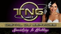
OK here are the first proofs. I have posted on facebook in different forums and I need to get back to the design company tomorrow so far I have heard the "Specializing in weddings" is a little to halloweenish font. But I'm looking for opinions here.

View attachment 27157 View attachment 27158

I agree, not quite the right font there. Also, you have each word on the back in the gold section capitalized. I would go with lowercase. Also lowercase for the word "in". Specializing in Weddings.
 
Well here is the final, some advice I took and some advice I went with from other peeps as well. I did keep the font in front, I did a poll with some of my current and past brides and other DJ's as well and they liked it. Here is the final and it went out today to go to the Printshop. I'm very pleased with it and it will also be something that in the future we can have new brochures done as well.

TNGCardfront.jpg Card Back.jpg
 
Sorry...........eye-catching, absolutely. It's your image you're projecting.

Bingo!
The card should match YOUR personality and image!
Personally, I don't sell myself on "elegance and style"...cause that's not the kind of guy I am.
If they're asking for a card, they probably have a pretty good idea of what I am like.

Ron, I agree with the others...
the "picture" takes up too much room but doesn't offer any benefit.
It doesn't allow for enough room for all the text you have....which is a little too much text IMHO.

My card is nothing more than my GoldPlated "banner"...
along with "mobile DJ, event host, voice talent, etc."
and my name and contact info.