My new look for 2009?

To many ads? Support ODJT and see no ads!

Hank Davidson

Affordable, yet priceless.
ODJT Supporter
Nov 15, 2006
7,354
1,663
60
Boston, MA
www.facebook.com
Hey, I finally designed something for myself. Just thought I'd share.

I'm seriously thinking of losing the name "Request Line Productions" and going under my actual name. I also want to switch from blue to burgundy.

Here's the logo


:sqcool:
 
It's beautiful! The only thing I might change is losing the on/off switch on the old timey microphone...not sure if it's really necessary and since you're kind of going for a retro type of look, why not make it a true retro mic? No one is going to call you on it or say at your function, "hey! your mic DOES have an on/off switch on it!" Ha....
 
I'm seriously thinking of losing the name "Request Line Productions" and going under my actual name. I also want to switch from blue to burgundy.

People might confuse you with yer cousin Harley... :sqlaugh: :rofl:


In all sincerity, I think it would be much better if you used your real name -- I never really liked RLP, sounds like a radio station, or a telemarketer... Your real name is easily remembered.
 
In all sincerity, I think it would be much better if you used your real name -- I never really liked RLP, sounds like a radio station, or a telemarketer... Your real name is easily remembered.

Exactly. :sqwink: Most of my business is word of mouth (which I like) anyway.
 
It's beautiful! The only thing I might change is losing the on/off switch on the old timey microphone...not sure if it's really necessary and since you're kind of going for a retro type of look, why not make it a true retro mic? No one is going to call you on it or say at your function, "hey! your mic DOES have an on/off switch on it!" Ha....

Thanks Kevin. Try this one


.
 
I would make word "DJ" much larger. It takes a few seconds to realize that you are not a singer or radio person. Otherwise very nice.
 
Not bad, but try putting "DJ" in big letters on the left side of the mic, "Hank" on the right side of the mic, and "Davidson" below the whole thing.

(Alternately, put "DJ" and the mic on top and "Hank Davidson" below it).
 
I would prefer having your letters layer the microphone versus the microphone on top of them like it is. Just being anal.
 
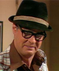
Nice play on the Harley font. Looks good, seriously...but being the twisted individual that I am, it reminds me of
"Fred Garvin, Male Prostitute"
View attachment 10402
 

Attachments

  • DanAykroyd.jpg
    DanAykroyd.jpg
    23 KB · Views: 78
The Hank Davidson name has pluses & minuses --- the minus is: using your name pigeonholes you as a single op w/o backup.

The microphone looks old fashioned (like an old Elvis record).

Even the font is old fashioned.

IMO --This is not Hank's best work -- I like the one he did for JTV much better.

Back to the drawing board, please!

Ask your wife & daughters (they won't lie to you!)
 
The Hank Davidson name has pluses & minuses --- the minus is: using your name pigeonholes you as a single op w/o backup.

The microphone looks old fashioned (like an old Elvis record).

Even the font is old fashioned.

IMO --This is not Hank's best work -- I like the one he did for JTV much better.

Back to the drawing board, please!

Ask your wife & daughters (they won't lie to you!)

1. I am a single-op and proud of it. My clients don't have back-up stand-ins either. Are there two dresses in case the bridal shop burns down?

2. Old fashioned or "retro"? Did you think the designer designing his own logo didn't know what he was going for?

3. My wife and daughter could care less. LOL!


Must be an east coast thing. :sqwink:

Thanks for your input Matt. I love you man!


Nothing's carved in stone yet. Thanks for the feedback gang! Everything will be considered.