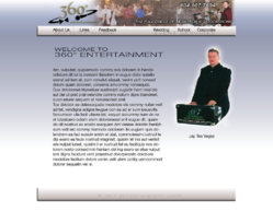
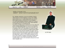
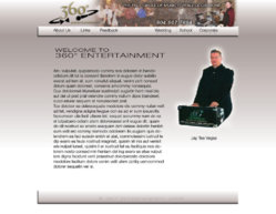
I have a couple color thoughts for my upcoming Site renovation

To many ads? Support ODJT and see no ads!

Jon Tuck

RIP Brother. You will be missed.
Staff member
Aug 8, 2006
23,275
625
68
Mississauga
www.360degreesent.com
Heres a view of a mock home page give me the positives and the negatives. Thanks. Choose a color as well.:sqwink: Dont go light I like the brutal honesty. Likes and dislikes.
 

Attachments

  • Blue website layout template concept2.jpg
    Blue website layout template concept2.jpg
    104.2 KB · Views: 31
  • green website layout template concept4.jpg
    green website layout template concept4.jpg
    105.6 KB · Views: 19
  • silver`website layout template concept.jpg
    silver`website layout template concept.jpg
    103.3 KB · Views: 14
Hey JT,

Look happier, smile. That's about it for me.

Dave

ps. Don't get me wrong, you look good in the photo, but it looks too serious. You don't need to do a dj/point at me shot.
 
I'd rather see you photo as the actual photo, not you "cut" out of it and then plopped somewhere else...To me it doesn't look right....

Of the 3...I like the blue the best...

What? You don't like the floating head motif?

O Great and Powerful Head.... Tell us What Music to Dance to....:rofl:
 
I'd switch pictures....

The dood in the black suit looks like a wimp.........:sqlaugh::sqlaugh:


J/k.....I agree with the others, Smile more, People might think you will kick there asses if they request a dumb song...:sqlaugh:
 
If I must choose betwen this three - i take the second one.

I like more Pastel colors like Pistacio green in combination with Orange,Black...
Or loock this one.Its not done jet but you get the picture.I like that way

www.mojlokal.com
 
I like the color of 3rd pic. Have to agree, you don't look like a happy DJ there, you look more like a lawyer that just brought his DJ system to the trial. (oh crap.....was that too honest?)You don't have to have a pic of just you on your first page, but if you do, show it as an entertainer with 150 people behind you having a great time.......just a thought. If this is your opening page, less writing on it, force them to go to other places on your site, keep your first page very very simple. (but that's just me) (ok, I'll shut up now)
 
Hey Jay,

I like the Blue colour.... looks the best to me... I also like the layout... Text needs some work, But its a great start!!

And don’t worry about the picture of you looking like your going to kill the SOB that requested the song that just BOMBED the floor... I like it! :sqrolleyes:
 
Dan yes it will be color coded as discussed. I appreciate every comment. Of course, for those who dont like it your requests will move to the bottom of my play list LOL or I break a da face.
Im most interested in the top logo banner and layout etc and of course the color flow etc. Text amount and pictures are adjustable. I want to know flow and color matching etc.
 
Pull the logo down just a tad, the 6 in 360 gets clipped on top. The banner photo looks grainy rather then the effect you may have been going for. Try "A Full Circle..." instead of "The...". I like the near overlap of the two lines in the menu bar. I don't read Canadian so I can't comment on the text.:sqwink: And I agree with everybody else about the pic, I like the look of it, just smile...you look like a priest.
 
Top banner MUST be without pics.Put the pics somewhere else because the logo is the most important on the webside.People must know if they are at the right place and pics confuse them a bit(me for shure).You can make a bigger logo on the top.
I think Hank is the right adress for this things.

Just me.
 
Kind of like the blue color myself. :)

I'll have to go with some of the others about the pic. Use a full photo and show off your "pearly whites" and "smile"..Please? :sqbiggrin::sqwink:

LOL, but don't listen to me...because you know how "messy" our site is!:sqembarrassed::sqwink:
 
Thanks for all the input. Im also looking for a word that comes from viewing asides perhaps Crap LOL. Elegant? professional presentation?
Bride or client friendly? Easy on the eyes? Pure Garbage?
 
only 13 folks have opinions????????????
No worries Ill likely just go to the Disney forum for opinions. Sometimes I wonder LOL!!