Website Feedback Needed

To many ads? Support ODJT and see no ads!
Hi Randy,

I'll take a crack at this. If you are fishing for lobster, would you use a hook? If you are fishing for trout in a stream, would you use a trap?

Sorry to bring fish into the question, but WHAT are you looking for? Everything?

If a bride visits your website, as it looks now, will she find what she's looking for?
If a HS advisor finds your website, will they find the hook that will land them?

Another thing I found that caught my eye: Back by popular demand. Who asked you to come back? Not being a wise A**, but being sincere.

I'm being honest with my critique. If I can help, please let me know.

Best,

Dave

 
Randy... I DO like the new layout better. It doesn't feel claustrophobic it's nice and open. I do like the color background. I would increase the font size on "What Our Clients Say" it's a heading, set it up like the other sections. You might take a look at some color behind the other 3 sections too at some point.

If there is a way to adjust the color of the Splashcast Module I would lighten it as it really dominates that corner and detracts from the rest. If that's not an option maybe create another section "See Us In Action" here are so clips of some of our events etc etc with a link to the module on another page.
 
Thanks Dave, I do appreciate the comments. BTW, Dave, I think I found your site last night. I thought I could tell you were in radio. :) lol!

Doug - again, Thanks! I'll be moving from splashcast because of the lack of display options. It's a sweet little service that's extremely easy, but it lacks some much needed improvements so a person can blend it in more with their website. And, I just added the other sections this morning and I continue to tweak things. I've played around with some color, but haven't found the combination I like yet, but I'll get it.

Thanks for the feedback, everyone.
 
Hey Randy!

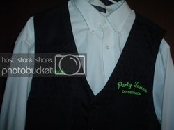
Can you post a pic of you or your son in your vest with your logo on it (stitched?)?

Coreen and I have been discussing this for some time now and I'd be curious to see what you've done.

Thanks,

Kirby
 
I'll be happy to. We went to a local tux shop that a friend owns and had her order us some nice vest, then we had the logo embroidered on them. The one that I can show you is the old logo and color scheme, but you'll still be able to get an idea on what they look like.

A full tux was overkill in our neck of the woods here, but these nice tux vests over a white shirt and black slacks really looked nice. We recieve many compliments.

The reason there aren't any photos of me/son right now, is because this spring I'm going to be having some professional shots done of us and the equipment, along with the new logo on the vests. Once I get that done, I'd like to place a bio and package pages on the site.

PS - anyone checking out the new site will probably need to refresh their screens.
 
Kirby (others) --- sorry for the bad photo, but I'm rushing out the door and wanted to get this posted before I forgot it. I just grabbed this out of the closet and took a quick snap of it. This was the old logo and color scheme prior to me joining up with my ex-partner (he retired).

DSC02334640x480.jpg
 
Randy,

I just checked out your site.

I like the colors (looks like you might have changed it since your first post).

The only recommendation I'd make is on your wedding page maybe use pictures of people dancing to help portray that you provide a fun service.
 
Thanks Randy! Looks very nice.... :thumbsup:

Soon as I lose a bit more weight, I'll be visiting our friends at the Bridal shop and get me a vest or two ordered...and then off to the shirt shop that does all our embroidery.....:)
 
I just gotta share this news.....I just went live with the new site on Sunday afternoon. My tracking showed several new hits to the site and one that has previously visited the site about a month ago, but this time they sent thru a 'request for information'.

That was this morning. We had a couple of emails back and forth and then a very nice conversation over lunch. Just chatting and she came out to tell me that the new site was what prompted her to use my contact form and made the decision to go with me....she told me the old site was 'just to dark' for her.

Even though, it carried much of the same information, it's packaged differently and that made a difference to her.

Again, thanks to everyone for helping me make the changes.
 
Good for you my friend thats how we roll here as a team and family to help one another improve our business.
 
Well, I can never be satisfied with anything.

My old site: http://www.djpartytunes.com/oldpage.htm has been tossed into the recycling bin and the new look is uploaded: http://www.djpartytunes.com

When I get done with some upcoming purchases (here I come Ben) I'll be having a new logo created.

Things may be a tad off in FF. I haven't tested and tweaked for it yet.

As always, any constructive feedback would be appreciated.
 
Been quite some time since I've done a complete update to the website, but it was time for a face lift. I'm still working on something for the right-hand side of the banner area --- probably some sort of pic montage.

My main goal was to try and consolidate some info to eliminate more 'clicks' for visitors to get the info they might need. I also built it on 1024 display, allowing more info on a page prior to scrolling vs. the old 800 display it was previously built upon. I'm also still tweaking the overall background color. I'm thinking something a bit darker might work better, but haven't found anything that has worked to my liking.

Please...no comment about the Facebook link to my galleries and photos. FB has been a huge asset, both in my personal and professional social connections. I really never thought it would be as successful as it has been for my business.

Any constructive comments or feedback would be appreciated.

www.djpartytunes.com