


Folks I need your opinions harsh good bad ugly whatever
- Thread starter Jon Tuck
- Start date
You are using an out of date browser. It may not display this or other websites correctly.
You should upgrade or use an alternative browser.
You should upgrade or use an alternative browser.



DjDennis
RIP- My Dad (2011), Sister (2013) and Mum (2017)
well if anyone wants some standard ring shots here are some you can download from here
http://rapidshare.com/files/160824301/Wedding_rings.rar
its a rar file as thats what best compression is used none of this crappy zip sorry
if you have any hassles just yell
jon you should also have a look you could also use another one if you need...
oh and hank - can I grab a copy just of the rings please..... thanks
http://rapidshare.com/files/160824301/Wedding_rings.rar
its a rar file as thats what best compression is used none of this crappy zip sorry
if you have any hassles just yell
jon you should also have a look you could also use another one if you need...
oh and hank - can I grab a copy just of the rings please..... thanks

Hmm art work is great I like the first and the last you have done. So Jon whats up here "network" what do you have in mind my brother. Do I see the makings of something larger than we are thinking in the "network". If so great idea and great logo. How much are member dues going to be Jon. 
DjDennis
RIP- My Dad (2011), Sister (2013) and Mum (2017)

Hank did you check the cookie Jar? I had my hand in it. The last one looks good. Do You think the exclamation point is proper? On the Catch phrase?
Guys let me tidy up things a bit and I will then give ya the plan.
Guys let me tidy up things a bit and I will then give ya the plan.
Thanks Dennis: Heart Rings
Hank since you have no problem with giving a copy of the rings do you have a psd of it. I use this on my LCD at weddings and I love those rings.
Attachments
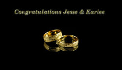

I may be wrong, but I don't think Hank actually DREW those rings. Did you, Hank? I think it is an image available for purchase. If so, it is illegal for someone who did not pay for it to use it.
I may be wrong, but I don't think Hank actually DREW those rings. Did you, Hank? I think it is an image available for purchase. If so, it is illegal for someone who did not pay for it to use it.
Ok then please tell me where I can purchase the PSD file and I would be happy to.
I may be wrong, but I don't think Hank actually DREW those rings. Did you, Hank? I think it is an image available for purchase. If so, it is illegal for someone who did not pay for it to use it.
It's a royalty free Shutterstock image that I paid for. I don't think the ring police are coming after us anytime soon.
DjDennis
RIP- My Dad (2011), Sister (2013) and Mum (2017)
It's a royalty free Shutterstock image that I paid for. I don't think the ring police are coming after us anytime soon.
thats where I got mine from all royalty free
I just put all that I have in a rar file and uploaded them as above

the basic look and the idea is excellent
but the 360 doesn't stand out
and the text below is hard to read.
it looks great up close,
maybe on letterhead
or even a website
but imagine if it was BILLBOARD size
if you cannot read it, and get the message in a second or two
it may not have an impact
think about how it would look on a table skirt
from the opposite end of the reception hall
but the 360 doesn't stand out
and the text below is hard to read.
it looks great up close,
maybe on letterhead
or even a website
but imagine if it was BILLBOARD size
if you cannot read it, and get the message in a second or two
it may not have an impact
think about how it would look on a table skirt
from the opposite end of the reception hall
You will be hard pressed to find a bigger fan of Hank's work then me! He did my last business cards and I think I need to get some help from him again...(hank, I'm sending you an email later... )
)
However...I am in the minority but I don't really care for the rings at all. In the first version it reminds me of a jewelry store and it also seems like many of todays brides are opting for white gold instead. The gold in the rings looks brassy and cheap to me. Just my opinion and obviously I am waaaay in the minority so keep that in mind...
This one is still my favorite!
It is SO strong and is such a striking image...why not just change the wording below and a different color scheme? It would sync in with this original logo more strongly and still convey the whole "wedding network" image you are trying to get across.
)However...I am in the minority but I don't really care for the rings at all. In the first version it reminds me of a jewelry store and it also seems like many of todays brides are opting for white gold instead. The gold in the rings looks brassy and cheap to me. Just my opinion and obviously I am waaaay in the minority so keep that in mind...
This one is still my favorite!

It is SO strong and is such a striking image...why not just change the wording below and a different color scheme? It would sync in with this original logo more strongly and still convey the whole "wedding network" image you are trying to get across.